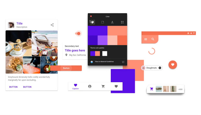
The app has been revamped with clear, vibrant colours with rounded corners. The basic layout of the app is still the same, but it now utilises the Google Sans font to give a more cleaner look. The UI is now all white with the blue band on top removed. Indeed, the clear white interface will be the first thing you notice after the update.
The ‘contacts’ section is now center-aligned, moved from next to the action bar. Even the fonts and other markers are now in a light blue colour. Overall, the change makes the app look much more aesthetic. It’s also not that hard to get used to. Most of the elements are in the same place, and the ones that have changed are now in a better position to access.
The list of contacts appear the same and so is the navigation drawer. Only, the icons have been updated Material Theme. The icons now have bold outlines with hollow interiors. The new icons also appear when you are placing a call or opening a contact. Email and text shortcuts also have the new icons.
The contact image no longer takes up the full screen and the white background is present to improve the visibility of the navigation buttons. You can download the new version of the Contacts app in the Play Store.
from Latest Technology News https://ift.tt/2AYeoVq


